What Are Pigments, Anyway?
Artist pigments are finely ground natural or synthetic substances that give paint its color. Understanding pigments is essential for any artist. The choice of pigment affects a color’s vibrancy, mixing behavior, drying time, and long-term stability. It does not matter if you are a novice learning the ropes or a seasoned professional refining your palette; selecting the right pigments helps elevate your work both aesthetically and technically. In this Ultimate Guide to Pigments, you’ll gain the tools to make informed, archival-grade decisions.
The Different Types of Pigments
Natural Pigments
Natural pigments are derived from minerals, plants, and even insects. These were the original tools of painters and still hold up beautifully. Natural pigments have a grounded feel I really enjoy. They’re earthy, honest, and often bring a kind of quiet richness that synthetics don’t always hit.
- Unique, nuanced colors
- Rich cultural and historical significance
- Often more environmentally friendly
- Generally faster drying (especially earth tones)
| Pigment Name | Code | Notes |
|---|---|---|
| Yellow Ochre | PY43 | Natural hydrated iron oxide, warm earthy yellow |
| Burnt Sienna | PBr7 | Heated natural clay, reddish brown |
| Raw Umber | PBr7 | Cooler and darker than burnt sienna, not calcined |
| Ultramarine Blue | PB29 | Derived from lapis lazuli historically, now synthetic |
| Madder Root | NR9 | Traditional red lake pigment, fugitive without protection |
Synthetic Pigments
Synthetic pigments are made in a lab, but that doesn’t mean they lack soul. These are the powerhouses in most modern palettes, giving you bold color, high tinting strength, and predictable performance.
- Broad and consistent color range
- Higher tinting strength
- Often more lightfast and archival
- May pose health or environmental risks depending on chemical composition
| Pigment Name | Pigment Code | Type/Family | Characteristics | Notes |
|---|---|---|---|---|
| Phthalo Blue | PB15 | Phthalocyanine | Transparent, cool, intense | Very staining, use sparingly |
| Phthalo Green | PG7 or PG36 | Phthalocyanine | Transparent, strong tinting | Overpowers easily |
| Quinacridone Magenta | PR122 | Quinacridone | Lightfast, vibrant, clean mixer | Excellent Alizarin substitute |
| Cadmium Red | PR108 | Cadmium-based | Opaque, bold, archival | Toxic, wear gloves |
| Cadmium Yellow | PY37 | Cadmium-based | Opaque, warm yellow | Toxic, avoid sanding or ingestion |
| Cobalt Blue | PB28 | Cobalt-based | Soft blue, semi-opaque | Expensive but highly permanent |
| Hansa Yellow Light | PY3 or PY74 | Arylide (monoazo) | Bright, semi-transparent | PY74 more lightfast than PY3 |
| Dioxazine Purple | PV23 | Anthraquinone | Deep, transparent violet | May be light-sensitive over time |
| Ultramarine (synthetic) | PB29 | Sodium aluminosilicate | Transparent, cooler blue | Same as historic ultramarine |
Fugitive Pigments
Fugitive pigments fade, shift, or disappear when exposed to light over time. I avoid these unless I’m doing sketchbook studies or decorative work where permanence isn’t a concern. If you’re going for archival, these are a no-go.
| Pigment Name | Code | Notes |
|---|---|---|
| Alizarin Crimson | PR83 | Deep red, beautiful but fades unless stabilized |
| Rose Madder Genuine | NR9 | Historic pink/red, extremely fugitive |
| Indigo (Natural) | NB1 | Plant-based dye, fades rapidly without proper sealing |
| Aureolin | PY40 | Known to discolor or fade over time |
Modern alternatives like Quinacridone pigments offer better lightfastness and similar visual impact.
Understanding Pigment Labels
Pigment codes are a simple way to decode what’s actually in your tube. Once you know the numbers, you’ll never be fooled by fancy names again.
| Prefix | Stands For | Example |
|---|---|---|
| PW | Pigment White | PW6 = Titanium White |
| PY | Pigment Yellow | PY43 = Yellow Ochre |
| PO | Pigment Orange | PO20 = Benzimidazolone |
| PR | Pigment Red | PR108 = Cadmium Red |
| PV | Pigment Violet | PV23 = Dioxazine Violet |
| PB | Pigment Blue | PB29 = Ultramarine Blue |
| PG | Pigment Green | PG18 = Viridian |
| PBr | Pigment Brown | PBr7 = Burnt Umber |
| PBk | Pigment Black | PBk6 = Lamp Black |
Lightfast Pigments
Lightfastness tells you how a pigment will hold up under light. For work that lasts, you want colors rated I or II by ASTM.
| Pigment Name | Code | ASTM Rating | Notes |
|---|---|---|---|
| Titanium White | PW6 | I | Bright, stable, non-yellowing |
| Yellow Ochre | PY43 | I | Warm, natural yellow earth tone |
| Burnt Umber | PBr7 | I | Great for underpainting; fast-drying |
| Ultramarine Blue | PB29 | I | Transparent, slightly slow drying |
| Quinacridone Magenta | PR122 | I–II | Excellent color mixer, floral applications |
| Phthalo Blue | PB15 | I | Extremely strong tinting, cool blue |
| Cadmium Red | PR108 | I | Opaque and bold |
| Cobalt Blue | PB28 | I | Archival quality, soft and stable |
| Viridian | PG18 | I | Transparent cool green, slightly granulating |
Pigment Properties Every Artist Should Know
Transparency and Opacity
Transparent pigments are great for layering and glazing. Opaques are perfect for bold marks and corrections. Get to know which is which in your palette. This saves you time and frustration.
Tinting Strength
High-tinting pigments, such as Phthalo Blue, can quickly dominate a mix. Earth pigments tend to be more mellow and easy to control. If your mixes are going sideways, tinting strength is probably the issue.
Hue, Chroma, and Value
Hue is your base color. Chroma is its intensity. Value is how light or dark it is. Understanding these gives you more control and makes color mixing a whole lot easier.
How to Choose Pigments for Your Palette
Single-Pigment vs. Mixed Colors
I stick to mostly single-pigment colors. They’re clean, reliable, and mix without turning into mud. You also get better control when you know exactly what’s in the tube.
Tips for Building a Versatile Palette
- Choose single-pigment paints when you can
- Balance opaque and transparent colors
- Stick with ASTM I or II lightfastness ratings
- Use a mix of warm and cool primaries plus a few earth tones
Pigment Quality and Price
You get what you pay for. High-end pigments are more concentrated, contain fewer fillers, and behave beautifully on the brush. They also tend to go further — so yes, the price is worth it.
Expensive Pigments (Approximate Prices)
| Pigment | Code | Price Range |
|---|---|---|
| Cobalt Violet | PG20 | $30–40 |
| Genuine Vermilion | PR106 | $50–100+ |
| Genuine Lapis Ultramarine | PB29 | $50–70 |
| Cadmium Red Deep | PR108 | $20–30 |
Affordable Essentials
- Titanium White (PW6)
- Yellow Ochre (PY43)
- Ultramarine Blue (PB29)
- Burnt Umber (PBr7)
These give you serious mileage and are ideal for anyone starting or refining their core palette.
Frequently Asked Questions (Pigment FAQs)
How can I tell if my pigments are high-quality?
Look for clear pigment codes, strong coverage, and color intensity. Brands that list pigment numbers are usually the ones doing it right.
What does the pigment number mean?
It’s a code that tells you the exact pigment used. It helps you avoid buying duplicates or sketchy blends with fillers.
Should I avoid certain pigments for health reasons?
Yes, if you’re sanding or spraying them. Pigments with lead, cadmium, and cobalt are toxic, but you can use them safely if you take precautions. I wear gloves and work in a ventilated space. Not a big deal.
Are student-grade pigments ever good enough?
Not in my experience. Once you try professional-grade, there’s no going back. The paint flows better, looks better, and holds up better. If you’re serious, start upgrading now.
Recommended Pigment Brands and Sources
These brands all label pigment numbers clearly and offer excellent lightfastness:
- Michael Harding – Handmade, vibrant, archival
- Williamsburg – Traditional textures and rich earths
- Gamblin – Artist-grade with safety in mind
- Old Holland – Deep, luminous, old-master pigments
For Further Learning
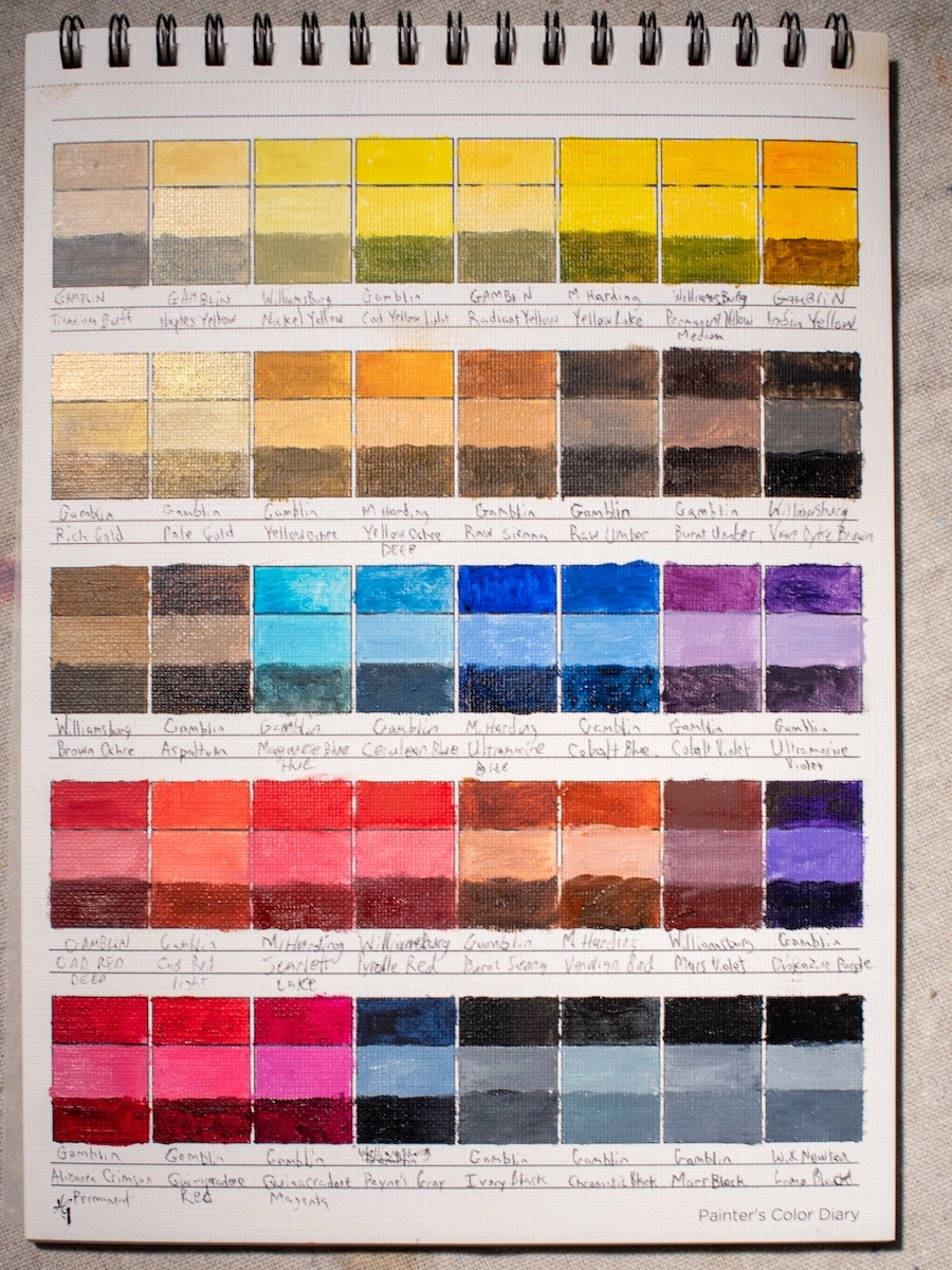
Start your own pigment diary. Swatch out your paints as mass tone, tint, tone, and shade using linseed oil or your preferred medium. It’ll teach you more about your colors than any chart can. I use HG Art Concepts Painters Color Diary. It’s spiral bound and archival.
For a quick reference, I put together a simple printable PDF pigment chart . It includes the most common natural and synthetic pigments, plus a cheat sheet on lightfastness. I use this kind of thing all the time when I’m swatching new colors or planning a palette. So, print it out, stick it in your sketchbook, or tape it to your studio wall. It’s not fancy, just super useful.


