If you’ve ever struggled with mixing colors and making your painting look like the vibrant image in your head, here is a peek into how to mix color confidently in oil painting.
Every oil painter has wrestled with muddy colors. It’s almost a rite of passage. It’s not a failure of your skill or a lack of talent, and it doesn’t mean you cannot mix colors confidently. It usually means something in your approach needs adjusting.
The good news is that muddy colors are completely fixable. One of my favorite things about being a painter is that nothing is beyond repair when it comes to adjusting the hues and values in your work, because you can always paint over it. Kids know this instinctively. They don’t hesitate. They make a mark because making the mark is the point. Many adults forget this freedom and start painting like all mistakes could be fatal. Here are some things I learned throughout my oil painting practice that help me mix color confidently.
1. Your Mix Has Too Many Pigments in It
This is the number-one cause of muddy colors. Most beginners don’t realize that the more pigments you mix, the duller the result becomes. Even if you are only using two tubes of paint, many paints sold in stores are multi-pigment blends that tend to turn muddy quickly, not from the color on the label but if the other pigments are complimentary colors (opposite on the color wheel) its going to make mud.
Fix It
Use single-pigment paints whenever possible. Williamsburg is my go-to for that reason.
Affiliate cues:
Affiliate cues:
Fewer ingredients, fewer surprises, brighter results.
2. You’re Mixing Warm + Cool Without Realizing It
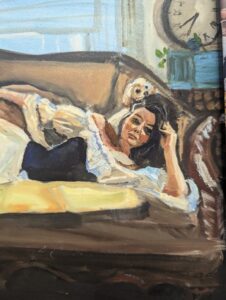
Color bias matters. Ultramarine is a red-biased blue. Lemon Yellow is a green-biased yellow. If you mix a warm-biased color with a cool-biased partner, you’ll often get grey. However, when you are painting a subject, such as flesh, your colors will pop if you put cooler and warmer shades of the same color next to each other, especially if you use the cools for shadows and warmer colors next to the shadows where the light is hitting.

Fix It
Learn the bias of your primaries. My CMYK reimagined primaries blog goes deeper into this. If you want clean secondaries, start with pigments that lean in the same direction.
3. Your Underlayer Isn’t Dry Enough
If you’re mixing wet-on-wet, it is possible to keep your colors bright if you aren’t over-mixing on your painting surface. If you want to be sure that the colors pop, waiting until the paint is dry before adding the brightest details can help elevate your painting. Some pigments dry fast, some slow, and some stay tacky for much longer than you expect.
To make jewel tones, glazing is the way to go. Paint with a lighter shade of the finished color you have in mind and apply your first layer lean using only a solvent like Gamsol to help the paint move and let it completely dry to the touch. Then you can add medium or oil to a transparent pigment to add depth to the color. The way the light shines through the layers is something that is difficult to replicate in other mediums. Remember this rule always, fat over lean. This applies to adding extra oils or mediums in general.

Fix It
See my Oil Paint Drying Time by Color blog (internal link). When in doubt, wait.
Or plan your painting in layers that follow the rule: fat over lean.
Or plan your painting in layers that follow the rule: fat over lean.
4. Your Brushes Are Dirty (Even If They Look Clean)
It is essential to use a palette knife when mixing your colors to keep them bright so your brushes do not get loaded with pigments that will leak into your painting, even if you wipe your brush. A brush that once touched a strong tinting pigment, such as Phthalo Blue, can sabotage your next mix without warning. You can designate a brush for cooler colors and one for warmer colors while you are working to keep your colors brighter. You must keep your brushes clean before changing colors to maintain control when you mix color confidently.
Fix It
Use a dedicated brush cleaner like Silicoil (affiliate cue) with Gamsol. It keeps the sludge out of your brushes when you are cleaning them.
Wipe your brush thoroughly between mixes with a rag or paper towel. Designate different brushes for cooler colors and warmer colors while you work.
Wipe your brush thoroughly between mixes with a rag or paper towel. Designate different brushes for cooler colors and warmer colors while you work.
5. Your Surface Is Fighting You
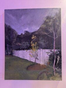
Yes, muddy colors can come from the wrong panel. If your surface is too absorbent, too slick, or too uneven, your color will die on contact. Rigid supports give your paint more clarity and luminosity.
Fix It
Use a stable, archival panel, like our oil-primed linen panels if you want your mixtures to sit on the surface and shine instead of sinking and dulling. Better color lives on better surfaces.
Internal link: Why We Started Making Our Own Painting Panels
6. You’re Overmixing Instead of Layering
Oil paint rewards restraint. If you mix aggressively on your palette or on the surface, you crush the pigments into a neutralized, exhausted state. Let your brush strokes exist next to each other without blending the colors together and step back.
Also,It is so tempting to mix colors with your brush, but if you premix you base colors with a palette knife, it makes a huge difference in the final presentation.
Fix It
Mix lightly with a palette knife. Lay your stroke. Step back. Let the paint interact optically, not physically. One practice that helps to keep from overworking the surface is to load the brush and make three thoughtful marks maximum before returning to the palette for more paint. This keeps you from overworking your bright colors into the background. Your future self will thank you.
7. You’re Judging Yourself Too Early
Here’s the part nobody talks about: muddy colors usually happen because you’re nervous. You hesitate, you second-guess, you nudge your mixture too long, and suddenly the life is gone.
Children do not have this hesitation. They paint. They commit. They make a mark and move on. Do not worry that you will fail before the brush hits the panel. I promise when you walk away and come back to it with fresh eyes, you will like it more and what needs adjusting will become more apparent than when you have been staring at it.
Fix It
Adopt the mindset:
“It doesn’t bother me anymore, because I can paint over anything.”
“It doesn’t bother me anymore, because I can paint over anything.”
This one belief gives you freedom, looseness, and flow. And ironically, your color gets better the moment you stop being precious.
If your painting feels tense, revisit my Unstoppable Artist Manifesto (internal link). Fear is the real mud-maker. Practicing with these tips will help you mix color confidently.
Bonus Tips for Cleaner, Brighter Color
Use a limited palette.
CMYK primaries are phenomenal for beginners and pros alike. Cleaner hues, fewer pigments, less mud. Also limit your use of white. A wonderful exercise one of my art professors suggested that changed the game for me was using Naples Yellow instead of white in your studies. I still include it on my palette because if you wait towards the end to add white it keeps most of your hues super saturated.

Place colors deliberately, don’t blend everything.
Oil has a beautiful way of optically mixing on the viewer’s eye.
Check your lighting.
Dim, warm bulbs can make your values look muddy when they’re not. A simple daylight lamp (affiliate cue) changes everything.
Practice on good surfaces.
Our panels are designed to support clean color, not suck the life out of it. It is the foundation of your entire painting. If you are making something special, its a great place to start.