If you’re struggling to make the vision in your head come to life on your canvas, learning to mix colors will level up your painting and help you resolve this issue.
I’m going to share what works for me to inspire you to experiment with your paints and bring your creations to life. This is for oil painters specifically. I’ll discuss how I prepare my palette, mix my colors, and add those final touches that make a painting feel complete.

Prepare a Full Palette
In addition to the traditional colors, I like to include others that give me a wider range and keep things interesting. I almost always add Gamblin Payne’s Grey. I like to mix my own blacks, and combining Payne’s Grey with Van Dyke Brown makes a muted, natural black that doesn’t look dead on the canvas.
A few other colors always on my palette are Williamsburg Indian Yellow, Gamblin Cobalt Teal, Gamblin Quinacridone Magenta, and Williamsburg Naples Yellow. These colors give me a lot of flexibility and subtle temperature shifts.
I just bought a large tube of Gamblin Titanium White, and I highly recommend it. It’s perfect for pulling out highlights that really pop and balancing those rich dark colors.
Premix Your Base Color
It’s easy to want to jump right in, but taking a little time to premix your base colors saves you a lot of frustration later. You can make great paintings with a limited palette, but if you’re trying to capture realism, you have to slow down and look. Nothing you’re painting is a flat color because shape, light, and texture change everything.
After I mix my base tones, I continue adjusting them throughout the painting. I continue to mix these colors to make them warmer or cooler, lighter or darker, depending on how the light is falling. Naples Yellow is one of my favorite ways to lighten color without killing its warmth, and Payne’s Grey helps keep shadows rich without flattening them out.


Getting Started
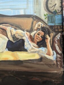
I like to tone my background first with a thin layer of acrylic paint, so I’m not starting on a white surface. Most acrylics are transparent enough that you can brush them lightly over your sketch and still see your lines. If I’m working on a buttery surface such as one of our acrylic-primed panels, I might spray a light fixative to hold the sketch, but most of the time I just go for it. If something smears, I can sketch it back in, no big deal.
When I start painting, I block in lean by with straight oil paint thinned with a bit of Gamsol to get things moving. I map out my values and adjust as I go, usually making my darks darker and my lights lighter once the whole painting starts to come together.
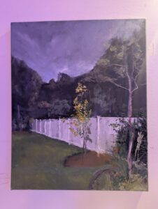
Color is always relative. The colors in the background won’t be as saturated as the foreground, so adding a little white to desaturate your background can help your main subject stand out.
Mix As You Go
Once you have your base down, keep mixing as you paint. The more you look, the more color you’ll see. Light curves across a surface, and saturation changes from area to area. The shadows shift cooler, especially if the light is warm. I make these adjustments throughout the painting because the colors are relative to each other.
There’s a lot more going on in those small transitions than most people realize. That’s where the painting starts to feel alive.


Add Luminosity to Details
When you get into the details, you’ll notice there are way more hues than you expect. As light moves across a curved form, the saturation and temperature shift constantly. Shadows usually lean cooler, especially when they’re set against warm light.
Adding small touches of Indian Yellow, Magenta, or Cobalt Teal can give depth and life to those subtle transitions.
Make Your Highlights Pop
I make sure there is plenty of contrast between my highlights and the surrounding areas to make them stand out. I try to add my highlights last so I can judge them against everything else.
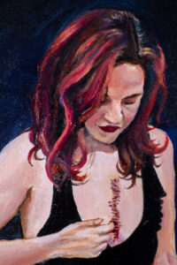
For example, if you’re painting a leaf, don’t grab one tube of green and paint the whole thing flat. Real leaves appear in warm and cool shifts, Light and shadow, with veins that catch light differently, and subtle contrasts that make them feel alive.
The better the lighting, the wider the range of color will be. You can use your palette to exaggerate what you see to make your luminous. Sometimes I will add a little hint of the pure color I’m trying to bring out to really make it pop, but only at this stage.
Practice Mixing and Observing
The best thing you can do for your color mixing is practice. Mix small swatches, push them lighter or darker, lean warm or cool, and see how far you can go. Put them next to each other and make sure the color you are mixing is either beautiful or makes the color beside it more attractive.
Every time you take the time to mix before diving in, your painting goes smoother. You’ll start to understand how colors relate to one another and how subtle changes affect the entire composition.
Learning to mix colors will level up your painting it also makes the entire process more enjoyable and satisfying.